ASSISTÈNCIA TÈCNICA CATALANA
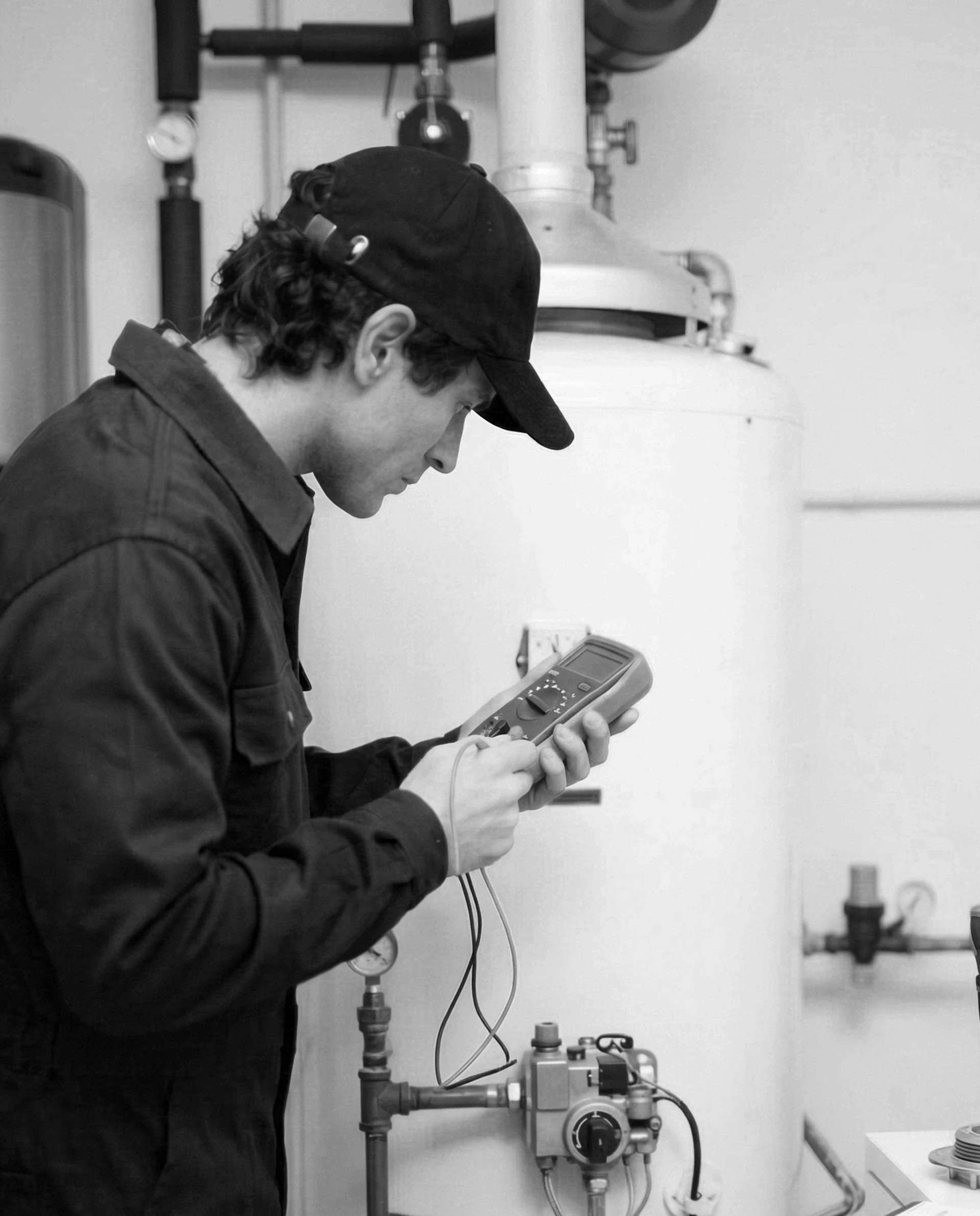
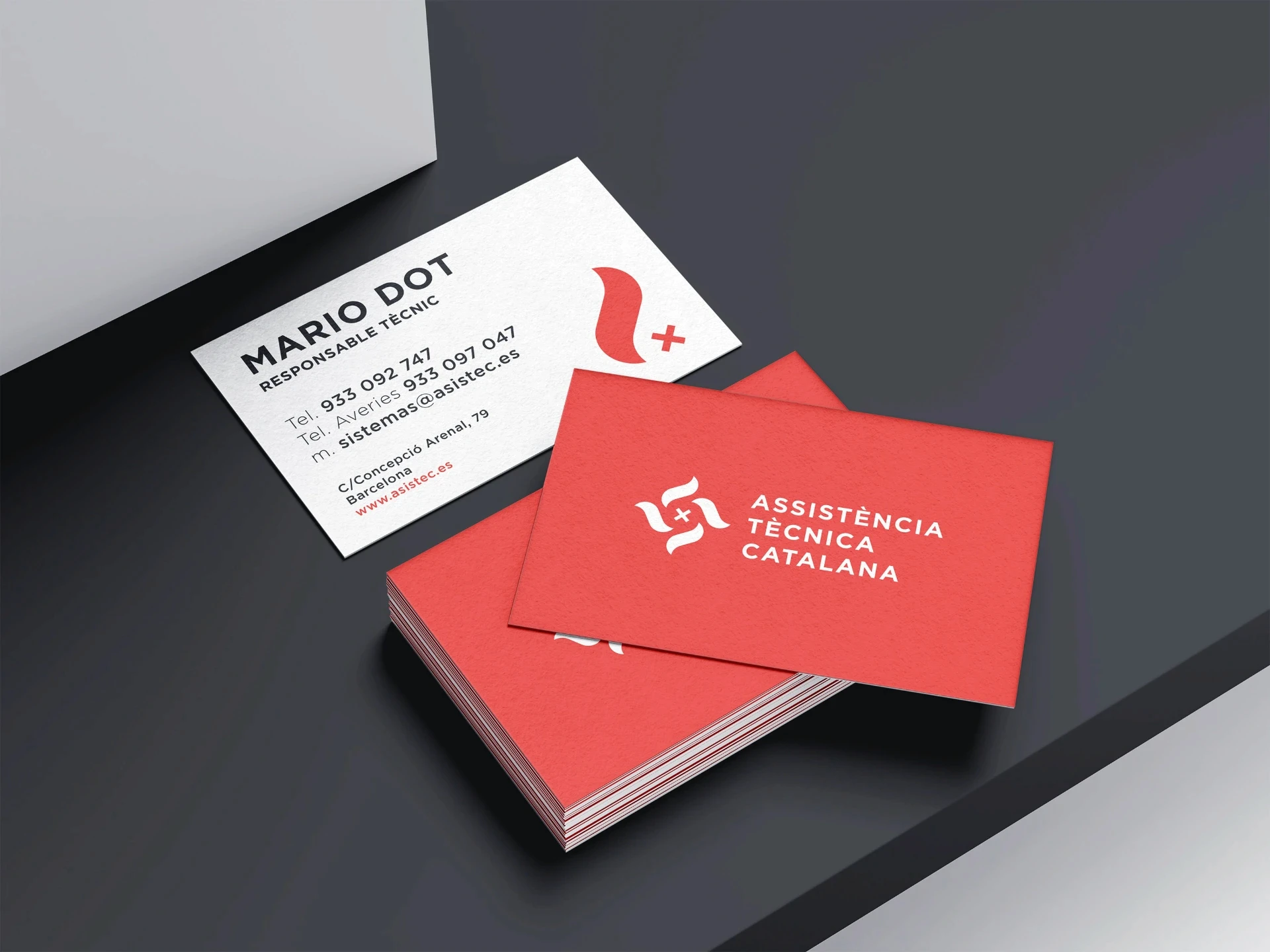
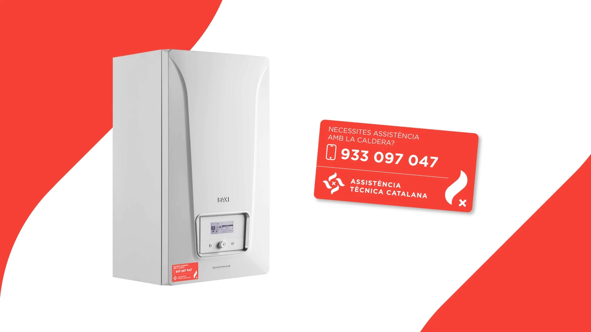
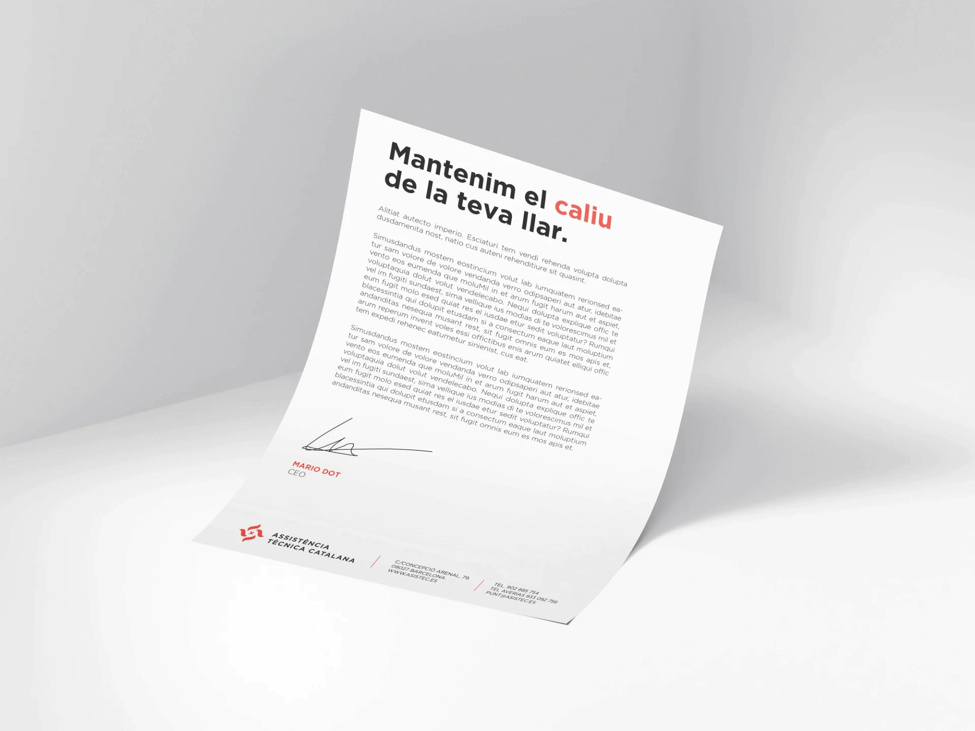
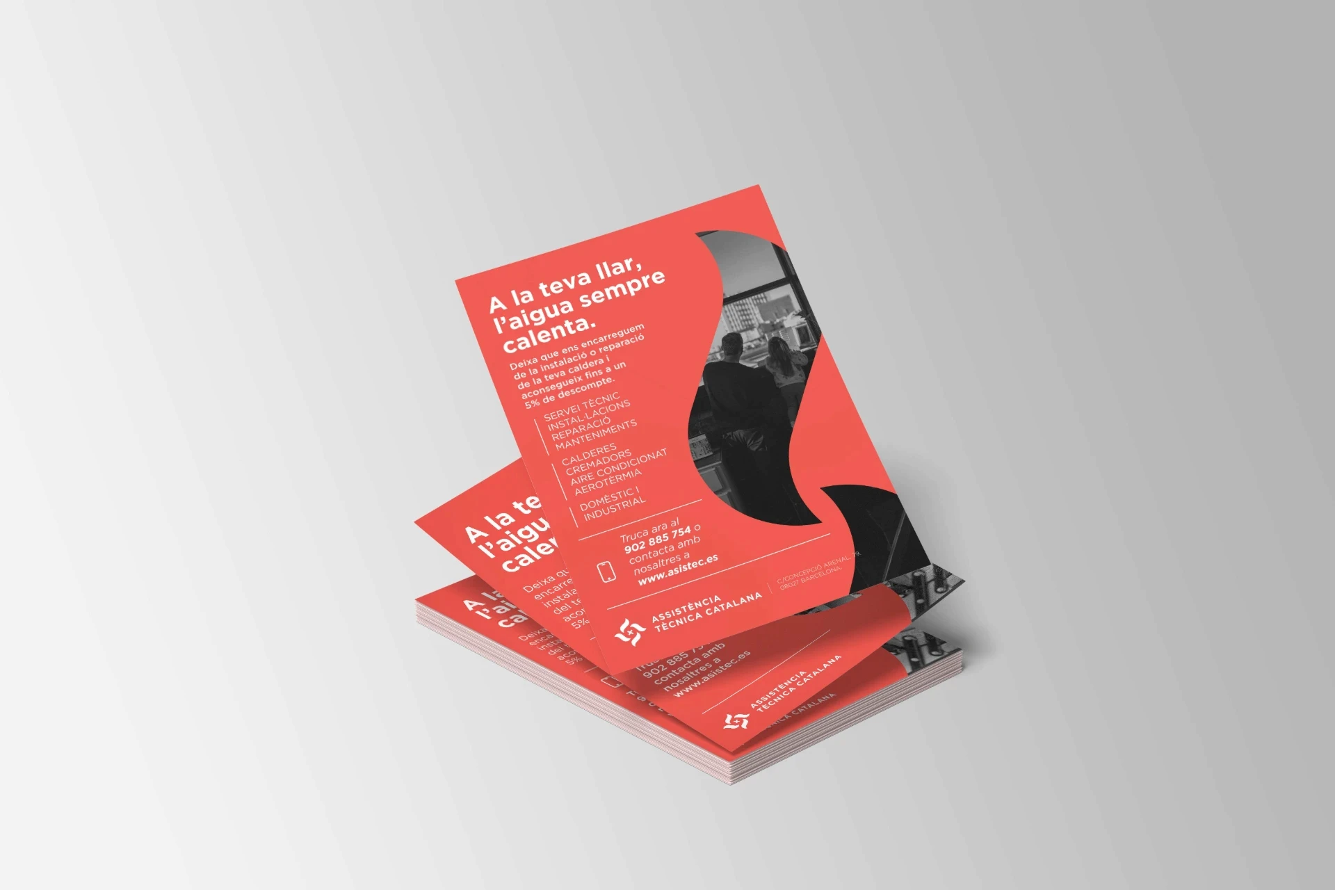
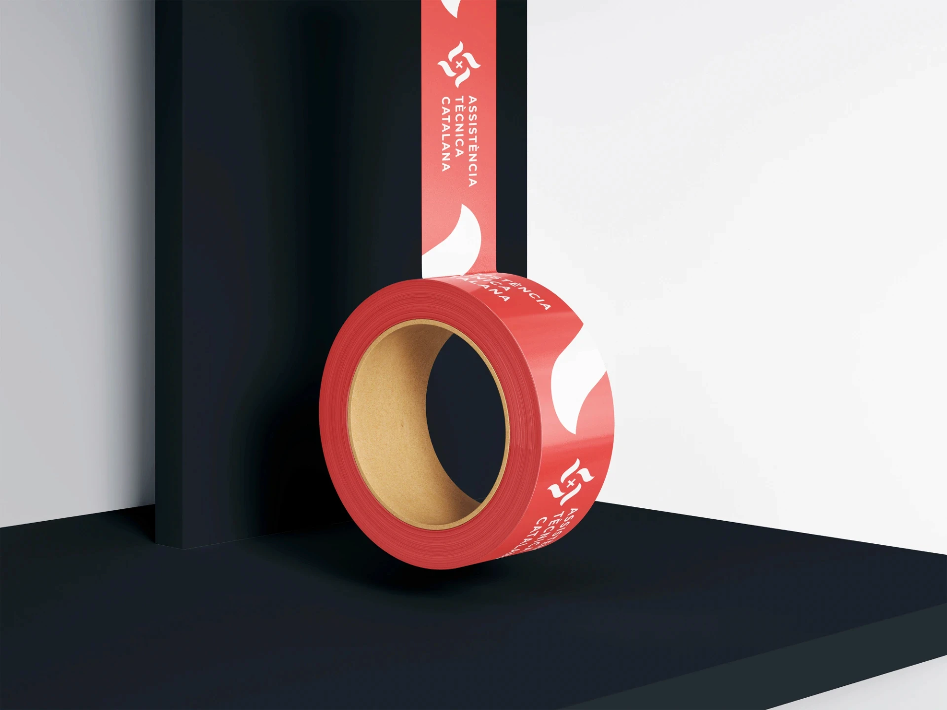
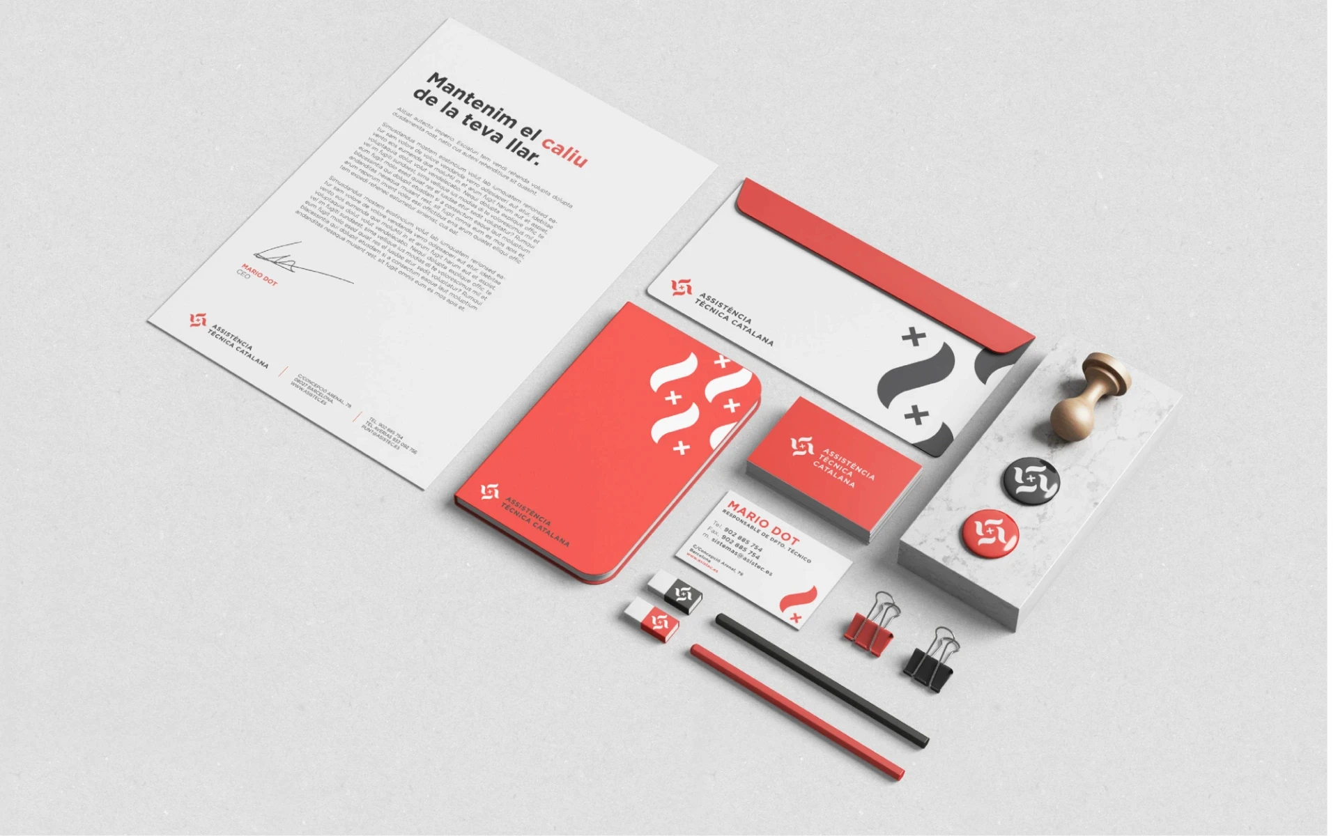
Assistència Tècnica Catalana is a boiler installation and repair company with a clear identity: local, reliable, and technically precise. The branding project had one central challenge — to translate all of that into a single, memorable mark. The logo condenses three ideas into one symbol: the flame, as a direct reference to the world of boilers and heat; the screw, representing technical expertise, installation, and repair; and the senyera, the Catalan flag, as a statement of local roots and proximity. Three elements that, combined, communicate exactly what the brand stands for — a company that is technically capable, locally grounded, and immediately recognizable in its field. The result is a branding system built around a logo that works as hard as the service it represents — clear, direct, and built to last. A visual identity that speaks the language of its clients without losing an ounce of character.
Year
2025
Client
ATC
Art Direction
AVAV/STUDIO®
Medium
Branding
Type
Graphic Design
ASSISTÈNCIA TÈCNICA CATALANA
Assistència Tècnica Catalana is a boiler installation and repair company with a clear identity: local, reliable, and technically precise. The branding project had one central challenge — to translate all of that into a single, memorable mark. The logo condenses three ideas into one symbol: the flame, as a direct reference to the world of boilers and heat; the screw, representing technical expertise, installation, and repair; and the senyera, the Catalan flag, as a statement of local roots and proximity. Three elements that, combined, communicate exactly what the brand stands for — a company that is technically capable, locally grounded, and immediately recognizable in its field. The result is a branding system built around a logo that works as hard as the service it represents — clear, direct, and built to last. A visual identity that speaks the language of its clients without losing an ounce of character.
Year
2025
Client
ATC
Art Direction
AVAV/STUDIO®
Medium
Branding
Type
Graphic Design


2026© AVAV/STUDIO®
Barcelona |
11:34
2026© AVAV/STUDIO®
Barcelona |
11:34